
Suplan
Region
Israel
Year
2024


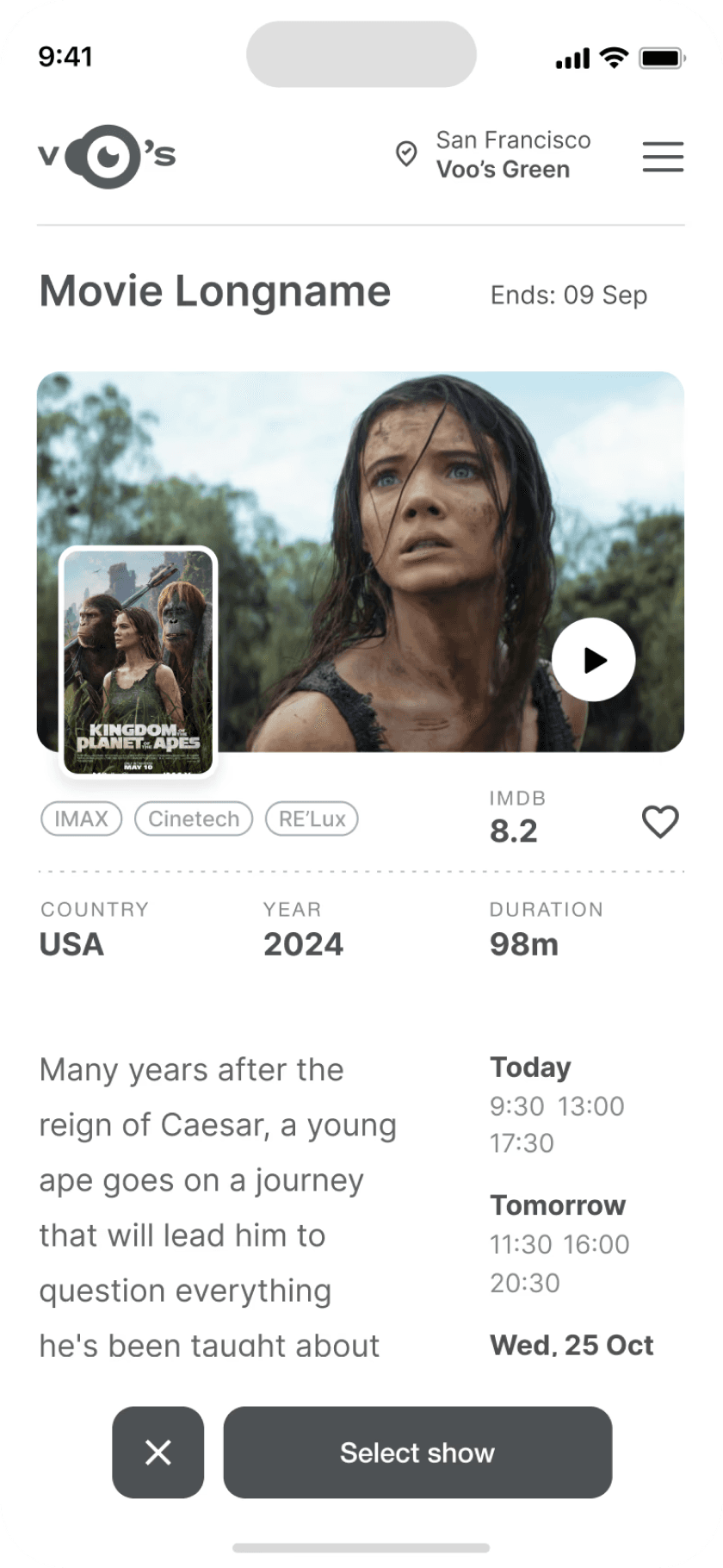

The project itself :
Project Overview
Suplan mobile app is designed for remote customer service teams to efficiently receive, manage, and track
incoming service requests. It streamlines communication, allowing teams to prioritize tasks, respond to
inquiries, etc. The app is optimized for ease of use, ensuring that team members can collaborate and manage
workflows seamlessly from anywhere.
Problem:
Remote customer service teams often face challenges in
efficiently managing and responding to incoming service
requests due to disjointed communication channels and lack of
centralized tools, leading to delayed responses and decreased
customer satisfaction.
Goal:
Design a mobile app that offers a centralized platform for
remote customer service teams to receive, manage, and report
service requests in real-time, enhancing task prioritization,
response times, and the overall customer experience.
My role:
UX designer leading the Suplan mobile application design.
Responsibilities:
•
conducting research,
•
conducting research,
•
conducting research,
•
conducting research,
•
conducting research,
•
conducting research,
All about the user :
User Research
I conducted user interviews with a service team members and managers to identify common challenges in
managing service requests, such as task prioritization and response delays. Insights gathered helped shape
features aimed at improving efficiency, communication, and reporting capabilities within the app.
Pain Points
Real-time updates:
Remote teams often struggle with
delayed or inconsistent updates on
service requests, leading to different
issues.
Task prioritization:
Without a clear system to prioritize
incoming requests, team members feel
overwhelmed or focus on less critical
tasks.
Reporting and analytics:
Remote teams frequently lack access
to detailed insights or performance
metrics, making it challenging to track
team efficiency etc.
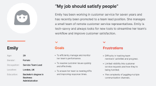
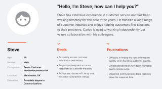
User Personas
Personas were selected by conducting user
research and identifying common pain points, that
frustrate and block the user from getting what they
need from a product.



User Journey Map
It is the series of experiences Carlos has as he
achieve a specific goal. It was built on the his
experience.
I developed a user journey map of Alexandr's experience with the app to identify potential pain points and areas for improvement.
Goal
To resolve customer issues quickly and effectively in an app in a fast and clear way.

The project schematically :
Starting the Design
Here I built some schemes and storyboards to clarify and understand information and architecture of the app.
After I created paper wireframes and than proceeded with building digital wireframes with a low-fidelity
prototype in order to conduct first usability studies with stakeholders.
Appmap
It's a structured scheme that outlines the pages
and content hierarchy of the app.
Next step: creating the application map. My goal here was to make strategic information architecture decisions that would improve overall
app navigation. The structure I chose was designed to make things simple and easy.

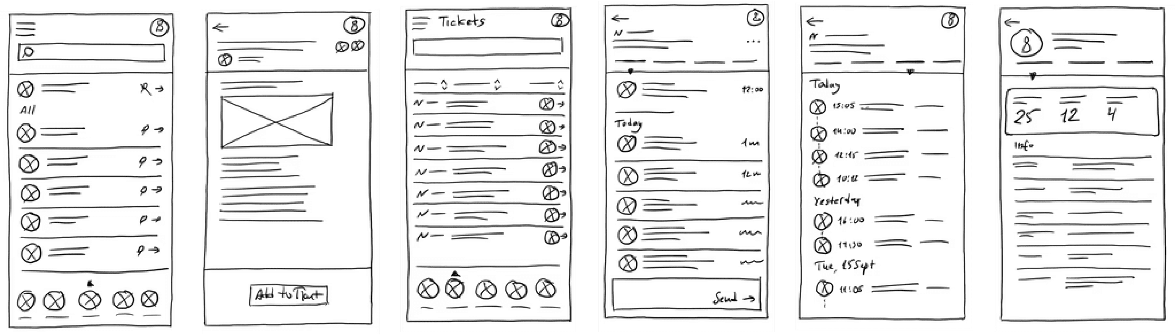
Paper Wireframes
They initially oriented on the basic structure of the
homepage and highlight the intended function of
each element.
Here, I sketched the key pages of the Suplan app, including the inbox, tickets, customer profile, and others. The goal was to explore
different ideas with wireframes.
Digital Wireframes
More "clear" version of wireframes in a digital form.
Also all the important pages are added
in it.
At this stage, I utilized the Figma design tool to create digital wireframes for all the pages, then organized them into a clear and cohesive
structure.
The goal is to show how all the pages and things interact with each other.

Usability Studies
This is an examination of users and their needs,
which adds realistic context to the design process.
First I conducted unmoderated usability studies with several participants, who answered various questions about the app and provided
their observations while interacting with the initial low-fidelity prototype. After collecting the data, I analyzed it and synthesized the
findings. Ultimately, I identified key themes and generated several insights. The goal was to identify pain points that the user experiences
with the app designs so the issues can be fixed before the final product launches.
Pin important letters:
Team member has to be able to pin the
most important emails in the inbox.
Highlight unread emails:
Unread emails should be underlined
so that you can quickly pay attention to
them and start solving the problem.
Highlight solved issues:
It's important to hide or highlight
solved problems, to pay attention to
the unsolved ones.
The clear version :
Refining Design
Here I created a static, high-fidelity Suplan app design (keeping in mind all the conclusions from the previous
phase of usability studies) that is a clear representation of a final product called design mockups.
After that, I created a high-fidelity prototype of the app.
Mockups
These are a high fidelity design that represents a
final product
I created all the app pages mockups, incorporating the right design elements such as typography, color, and iconography. Also I
developed all the necessary components and needed elements.
The goal was to demonstrate the final Suplan app in as much detail as possible.


High-fidelity prototype
It's the detailed, interactive version of designs
that closely match the look and feel of the final
product.
I turned my mockups into a prototype that's ready for testing, using gestures and motion, which can help enrich the user experience and
increase the usability of the app.

Inbox, pinned messages, inbox menu
Message and creating a ticket
Tickets list, tickets menu
Separate ticket page with tabs
Clients, clients menu
Client page with tabs
Dashboard with graphs
Chats and chat page
The project schematically :
Outcome
Now, finally, it remained to pay attention to several takeaways and plan some further steps.
Takeways
The series of hand-drawing frames that visually
describe and explore a user's experience with a
product.
Impact:
Service team members and managers have found the
Suplan app design to be intuitive and user-friendly, allowing
them to read their inbox, select messages related to issues,
create tickets, track updates, and collaborate with their
teammates easily.
What I learned:
The key lesson I learned is that even minor changes can
significantly impact the user experience. My biggest
takeaway is to always prioritize the genuine needs of the
user.
Next Steps
The series of hand-drawing frames that visually
describe and explore a user's experience with a
product.
Identify any additional areas of need and ideate on
new features.
Identify any additional areas of need and ideate on
new features.

Let me help with a great
visual solution for your
business.
To get in touch :
Contact Me

Set up a time to talk about your
design needs.
Follow me on:
Click to copy :
UIUXfolio
© 2025
404
Created by

Timofey Bak
All built in
Framer
Works
Research
Wireframes
Design
Outcome
Get template